New interactive absence dashboard
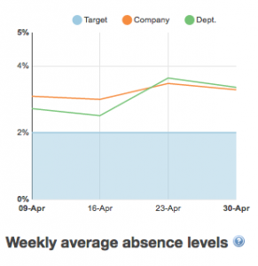
Weekly average absence levels
This chart shows your 7-day average absence levels over the last 4 weeks. Your absence level percentage is calculated based on [lost working time] as a proportion of [available working time]. Your target is set in your company preferences.
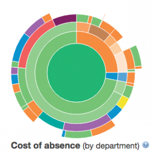
Cost of absence (by department)
The sunburst chart converts your departments’ absence levels to a cost figure based on your company’s average cost per absence day. The cost per day lost is set in your company preferences and Honeydew can help you calculate the correct figure.
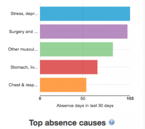
Top absence causes
This bar chart shows your last month’s absence days split by reasons for absence. There are 3 tiers to the data: first absence is split between medical, non-medical and authorised; then it is categorised in 21 different main categories, which each contain a varying number of specific absence reasons.
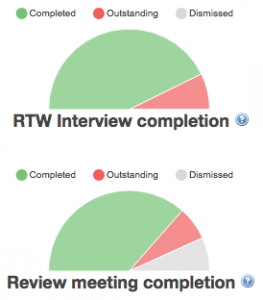
Task completion
The half moon pie charts show the completion status of all Return to Work interview and Review meeting tasks with a due date in the last 30 days (including today). Like in all the graphs, the data reflects your management area i.e. all employees whose absence records you can access. Depending on your access level this could be just your direct reports – or the whole company!
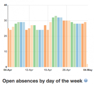
Open absences by day of the week
This bar chart counts the number of open absences every day of the last month. Each day of the week has its own colour so you can easily see if there is an absence pattern on particular weekdays.
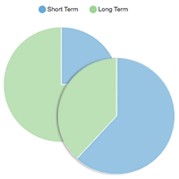
Short / Long term split
The usual absence trend in many companies is that about 30% of absence spells are due to long term absence but these amount to about 70% of lost time. This animated pie chart rotates between lost working time and number of absences – give it 10 seconds to see it change!
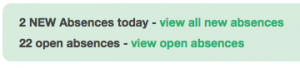
Links to today’s absences and tasks
The familiar links to today’s absentees and open tasks haven’t been removed. You will find these at the top of the dashboard, with the small change that you can see how many new absences have been reported today as well as how many open records there are. On the tasks side, we have added a link to RTW interviews specifically and a shortlist of overdue tasks, which now excludes tasks that are due in the future.