Dashboard upgrade
Engage interactive absence dashboard has had a major overhaul. We now bring even more data and analytics to our users right on the home screen. Here’s what’s new:
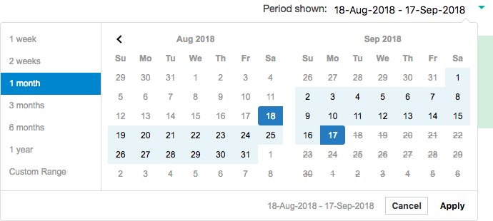
Set custom date periods
Goodbye 30-day default view, hello custom date picker! Set the time period you want to review, be it one week or one year. The charts will re-calculate the statistics live on-screen and within minutes you’ll have whatever overview you were looking for.
Select multiple departments at once
Today’s absentees, returns and cost
The updated Today’s absence snapshot at the top of the page continues to provide the helpful shortcuts to current absentee list as well as highlighting any new absences. Today’s returns can be used to manage Return to Work interview completion on the employee’s first day back.
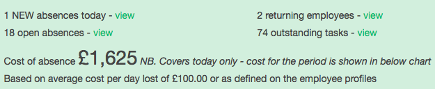
Brand new in this section is a headline figure for absence cost today. This number converts today’s absences into a cost value based on the company’s average cost per day lost (or employees’ personal cost figures if this has been defined). See the real daily impact of absence on your team or company.
Larger charts for easier reading
The overall layout of the dashboard has changed from 3 columns to 2 so that each chart is now much larger and easier to read. This way you can more easily compare multiple departments and longer date periods.
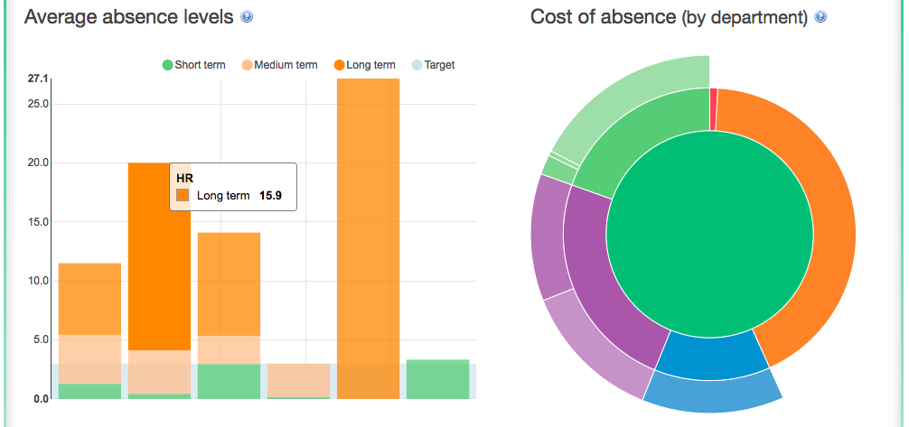
Absence level comparison between departments
The average absence levels chart allows you to compare departments similarly to a league table. The absence level percentage is calculated based on [lost working time] as a proportion of [available working time]. The chart also shows a target level, which is set in your company preferences.
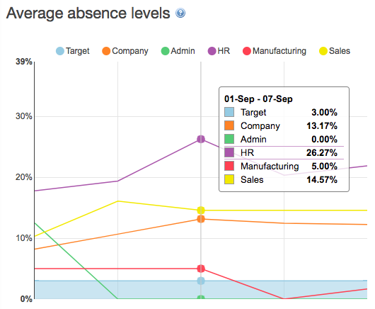
Choose one department in the drop-down menu at the top of the page to compare the departmental statistics to the company’s overall performance. Or select multiple departments to compare with each other.
If you select more than 4 departments, the graph will convert to a bar chart with overall absence percentages for the whole period, split by short and long term absence.
Cost of absence responds to department selection
The cost chart converts your departments’ absence levels to a cost figure based on your company’s average cost per absence day or employees’ personal cost figures, if these have been set on the employee profiles.
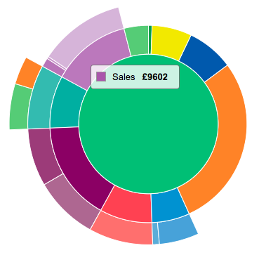
Click on the segments to drill down into the data or to return to high-level overview.
What’s new here is that changing your department selection at the top of the dashboard will now re-draw the cost chart to focus on the selected departments. Similarly, changing the dates triggers the chart to re-calculate the cost for the chosen period.
See the absence records behind the top absence causes
You’ll still see the familiar chart for drilling down to reasons for absence. Starting from the 3 main classes of absence; medical, non-medical and authorised, you can bring up the top 5 categories under each class and 5 top reasons within each category.
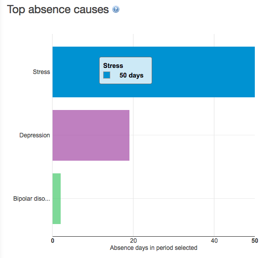
What’s new is that the specific reasons now link to a list of absentee names who were absent for that reason. (Remember, that depending on the date period you select, some of these absentees may already have returned to work.)
Task chart shortcuts to outstanding and dismissed tasks
The task charts now link to the related tasks for easier management action. The key focus here is of course on the outstanding tasks, which can be brought up by clicking on the red segments.
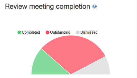
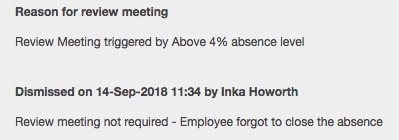
We’re particularly excited about the new option to review what tasks were dismissed, by whom and for what reason, which can be accessed by clicking on the grey segments.
Mondayitis and Friday fever exposed
Perhaps the most visible overhaul is in the way we display the absence trends by day of the week. Whereas you could previously see an total number of open spells on any given date, we now group all absence records based on the day of the week that they started. This quickly gives you an idea of whether your organisation suffers from “Mondayitis”.
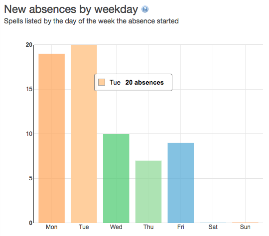
As before, the columns in the chart link to the absence records and you can click through to see which employees called in sick on a Monday this week or on a Wednesday after the football world cup final.
Spot the Buffalo Skivers and absence ghosts
Finally, the short and long term split is another good indicator of where to invest your absence management attention. The pie chart switches between proportion of long and short term absence in time and by number of spells. The common trend shows around 30% of spells are due to long term cases but they usually account for 70% of lost time.
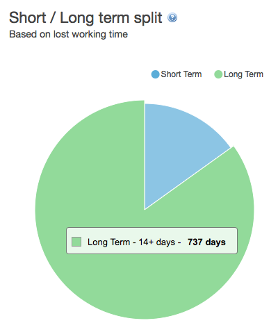
Click on the segment to see a list of short or long term absentees in the selected period and department(s).