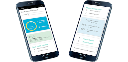
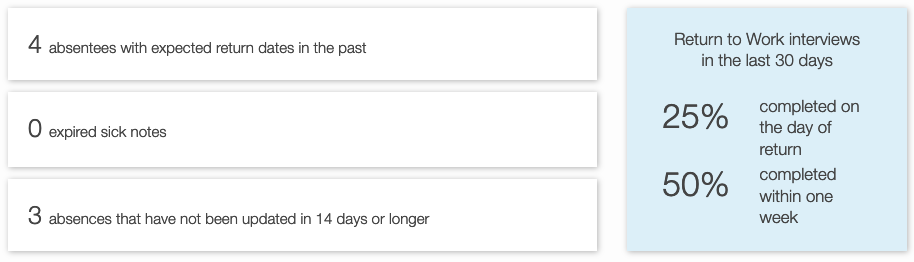
New improved live absence dashboard
We’re excited to announce that we are adding new data to the live dashboard on Engage. In addition to the period statistics that users are already familiar with, we are expanding the Today’s Snapshot section to cover a whole host of new information. This update is aimed to provide more prompts to line managers for actions they may need to take on the day and a better overview of how absence is trending today.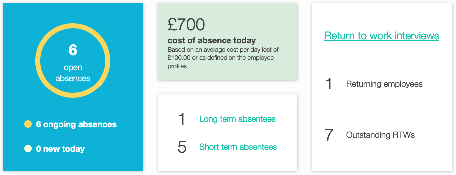
What’s new?
- Shortcuts to current short- and long-term absences
- Highlighting absence records that are out of date
- Return-to-Work interview metrics on day of return and 2nd day back
- Itemised to-do list with shortcuts to the relevant tasks
- Today’s absentees as a proportion of the workforce
Where are my charts?
The familiar charts won’t be pre-loaded on the home screen but they’re only a click away. The “Show Absence Charts” button will reveal the graphs. You’ll also have you the option to set the period to cover in the charts, like before. The charts cover things like:
- absence level development over a period of time
- absence cost split between departments
- trends on main absence reasons
- short- and long-term absence trends

It’s mobile-friendly and fully responsive!
What’s even better is that the whole home page is now mobile friendly and responsive so you can check your key data easily on the go!